The study of this kind of financial option is very important for real investment opportunities, because the irreversible investment expenditure on projects that generates continuous cash-flow is like a call option: in general is possible to wait and see for new informations and better conditions, and the waiting policy is optimal if the project is not deep in the money.
The American call analogy is one of best models to start real options applications,
due the simplicity of this framework, while remain theoretically sound
(see a note about the model).
You need only to know the present value of the operating project (revenue less operational cost
and taxes, all in present values), the (after-tax) present value of the investment, the interest rate, the
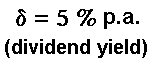
dividend yield (annual cash flow divided by the operating project value, in general) and the
time to expiration
of the investment opportunity. With these variables you can get the value of the
opportunity (option) to invest in real assets (projects).
In petroleum case, due the reservoir depletion, the dividend yield should be calculated in a less
trivial way. See the demonstration for the petroleum case in the tutorial page.
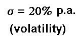
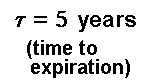
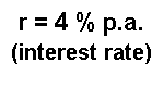
The analysis are performed starting from a Base Case
which assumes the following values:
The static graphs show the sensitivity analysis in a conventional way, but using hyperlinks to get easily the specific chart for a specific value. There are about 140 static charts to choose.
The dynamic charts presents the sensitivity analysis in a less conventional way, like a small movie where one line from the chart moves by changing continuously of one parameter from the Base Case. This issue is performed simply using animated-GIF method, one interesting visual facility from Web-Internet environment. There are 7 dynamic charts.
For both static and dynamic charts, this site presents two types of charts: charts about the option value and charts about thresholds for earlier option exercise (free-boundary).
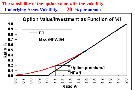
This kind of chart shows the option value F against the underlying asset value V.
These values are presented in the charts in normalized terms, that is, are values per unit
of investment I (or per unit of exercise price of the option) for
didatic reasons: if the ration V/I is more than 1, the option is in the money, and if this ratio is less
than 1 the option is out of money, so is easier to see in the chart how deep or out of money is the
option.
The option value is also per unit of investment (or per unit of exercise price).
Of course, to obtain the total option value F, just multiplies F/I by the investment (exercise price) I.
The use of these ratios is also useful to analyse investment
uncertainty effect.
There are two lines in the chart:
(a) the value at the expiration (the "now or never" value), the two black straight lines
which represent the maximum between
the payoff and zero, or in others words, between NPV and zero, where NPV ( NPV = V - I )
means net present value. I use the term NPV
in order to remember the analogy with real investments, which is the main goal of this analysis.
(b) the option value (the red curve), which values more than the expiration value except when the
option is sufficiently "deep in the money" (when F = NPV).
The point where the option curve smooth pasting the straight line from the payoff (the
NPV line) is the optimal level for early exercise of the option. At this point, the early exercise
is optimal, because the net waiting value (the option premium) is zero. This chart shows the
NPV and the option value F (both per unit of investment), for the underlying asset value of
1.1 times the exercise price (V/I = 1.1). Although the option is in the money, the net waiting value
(the option premium) is positive, so the option is not sufficiently deep in the money to be exercised.
Besides the volatility (showed in the graph-example above), also are performed sensitivity analysis for the other parameters (dividend yield, interest rate, time to expiration).
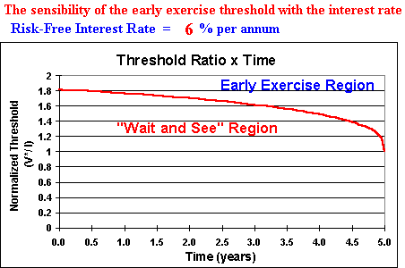
Also in this kind of chart the threshold V* is normalized by the investment value (or the exercise
price) I, so the Y axis shows the ratio V*/I.
For the case of 5 years to expiration, the chart shows that
the underlying asset value needs to reach more than 80% above the investment value, in order to be
optimal the immediate exercise of this option. In order words, the option is sufficiently deep in the
money only for V*/I > 1.8 if there are 5 years to expiration (and with the parameters values of the
example).
In real investment decisions, one threshold 80% above the project value means that the
traditional NPV rule (invest if VPL > 0) is not only wrong, it's very wrong (investment
decision too far from the optimal investment decision).
The region under the threshold line is the "wait and see" region (the option values more
live than dead), whereas above the line is the "immediate investment" region
(where is optimal "to kill" the option, exercising the option).
At the expiration (in the end of the fifth year), the threshold ratio is 1, so the NPV rule holds in
this case.
In this model, the NPV rule holds only in the now or never case and when the option is
sufficiently deep in the money.
At this point is useful to point that
there are some differences between the financial and real options, which is necessary to take
into consideration. One is the expiration time: in real options this time is frequently more than one or two
years, whereas in financial option case this time is shorter (the typical is two quarters, although there are
longer contracts, e.g. traded options on crude oil with three years length).
In petroleum offshore leases,
the typical time is 5 to 10 years, and even more in the case of patents rights (e.g. 20 years in Brazil).
So, the presented charts are showing time to expiration from 10 years to zero (with
several intermediate values).
See others differences between real and financial options in the tutorials page.
In the perfect competitive market situation, Leahy (Quarterly Journal of Economics,
1993, pp.1105-1133) proved the coincidence between a monopoly firm's option-value thresholds
(perpetual option) and a competitive firm's free entry threshold.
See a discussion of this remarkable result in
the Dixit & Pindyck book (chapter 8).